A practical guide explained for beginners who want a clean sticker design, the right cut settings, and print-ready exports.
Introduction
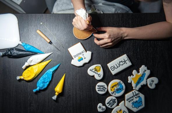
Stickers are a small format, but they solve real problems fast: labeling gear, adding a branded touch to packaging, making simple handouts for events, or creating a quick giveaway item. Because stickers are often viewed up close, minor layout issues—soft edges, cramped text, low contrast—show up immediately.
This guide is for anyone who needs stickers quickly without using professional design tools every day. The steps focus on decisions that reduce rework: choosing a sticker shape and size, keeping artwork readable after cutting, and exporting in a format that printers and cutting workflows can accept.
Custom sticker makers differ in how they handle sizing, how they support cut lines (often called “kiss cut” vs. “die cut”), and how cleanly they export for print. Many also vary in whether they can simulate backgrounds, add bleed, or preserve transparency for stickers that won’t be rectangular.
Adobe Express is a practical place to begin because it provides a simple way to assemble a sticker layout and export common file formats without a complex setup.
Step-by-Step How-To Guide for Using Custom Sticker Maker
Step 1: Start with a sticker layout and choose a shape
Goal
Set up a correctly sized canvas and shape so the design fits the intended sticker cut.
How to do it
- To design stickerswith Adobe Express, choose a sticker template or start from a blank layout.
- Decide on a sticker type: simple rectangle, circle, or a custom shape that follows the artwork.
- Pick a target size early (small labels vs. laptop stickers often need different text scale).
- Add a temporary “safe margin” by keeping important elements away from the edges.
- Save a duplicate file for alternate sizes or shape experiments.
What to watch for
- Small stickers need larger type than expected once cut and applied.
- Complex shapes require extra buffer so the cutter doesn’t clip important details.
- Designs that touch edges can look off if trimming varies slightly.
Tool notes
- Adobe Express is useful for quick sticker layout creation and basic resizing.
- Canva can help draft icon-and-text compositions quickly if you want to explore a few layout directions before finalizing.
Step 2: Collect artwork and confirm it’s print-safe
Goal
Use images and graphics that stay sharp and legal to reproduce.
How to do it
- Gather logos/icons in vector form (SVG/PDF) when possible; otherwise use high-resolution PNGs.
- If using photos, crop tightly to a clear subject and avoid tiny background detail.
- Confirm usage rights for any illustrations, photos, or quotes used on the sticker.
- Decide whether the background should be transparent (common for die-cut designs).
- Keep a “simple fallback” version (text-only or icon-only) if images do not hold up.
What to watch for
- Web-saved logos often print with jagged edges.
- Screenshots can introduce compression artifacts around text.
- Tiny fine lines may disappear after printing and lamination.
Tool notes
- Google Photos or Apple Photos can handle quick cropping and basic cleanup before import.
- If you need cleaner vector artwork, Affinity Designer or Adobe Illustrator can be used to rebuild a crisp icon or wordmark before exporting to PNG/SVG.
Step 3: Design for cut lines, outlines, and background choices
Goal
Make the sticker readable and ensure the cut won’t slice into key content.
How to do it
- Keep key text and icons inside a consistent “safe zone,” not near the edge.
- Add a border or “stroke” around the artwork if the design needs separation from backgrounds.
- Increase font size and weight for small stickers (thin fonts can look faded).
- Avoid placing small text on busy images; use solid shapes behind text when needed.
- If the sticker is a custom shape, plan for an even offset around the artwork.
What to watch for
- Borders that are too thin can look uneven after cutting.
- Busy backgrounds reduce legibility, especially at small sizes.
- Very tight margins make cutting variation obvious.
Tool notes
- Adobe Express makes it easy to add simple shapes behind text and adjust spacing quickly.
- If you need precise path-based outlines for a complex die-cut shape, Illustrator (or Inkscape) can help create a clean cut path before export.
Step 4: Decide on kiss cut vs. die cut, then add bleed
Goal
Match your file setup to how the sticker will be cut and printed.
How to do it
- Choose kiss cut when you want the sticker to peel from a larger backing sheet.
- Choose die cut when you want the sticker cut to its final outer shape.
- Add bleed by extending background colors or artwork slightly beyond the final cut edge.
- Keep a separate “cut-safe” version with extra padding if you’re unsure about the printer’s tolerances.
- If a print provider offers a template, align your design to it rather than guessing.
What to watch for
- No bleed can lead to a white halo if cutting shifts slightly.
- Too much bleed can change the intended look of thin borders.
- Some providers handle cut lines differently; unclear specs can cause delays.
Tool notes
- Adobe Express can handle simple bleed-style extensions for background shapes and colors.
- If you’re coordinating with a print shop, a proof PDF reviewed in Adobe Acrobat can help confirm where trim and bleed should fall.
Step 5: Preview at real size and run a “distance and detail” check
Goal
Confirm the sticker is readable and crisp at its actual physical dimensions.
How to do it
- Zoom out until the design appears roughly the size it will be in real life.
- Print a quick proof on plain paper at 100% scale if possible.
- Check that the smallest text remains readable and that thin lines don’t disappear.
- Verify that important elements do not sit near the edge where cuts may vary.
- If the sticker will be used outdoors or on bottles, consider slightly thicker lines and higher contrast.
What to watch for
- What looks readable on a monitor can be too small in the real world.
- Fine detail can blur after printing, especially on textured sticker stock.
- Dark backgrounds can make small text harder to read.
Tool notes
- Adobe Express supports quick size adjustments if the proof reveals readability problems.
- A basic printer preview in macOS/Windows can help confirm you are printing at 100% scale, not “fit to page.”
Step 6: Export print-ready files with the right format settings
Goal
Generate a clean file that preserves sharp edges and (when needed) transparency.
How to do it
- Export at the highest quality available; avoid web-optimized compression modes.
- Use PNG when you need transparency or crisp flat-color graphics.
- Use PDF when a print workflow expects a document format and consistent sizing.
- Re-open the exported file and inspect it at 100% zoom for halos, pixelation, or shifting.
- Keep the editable master file separate from exports and label versions clearly.
What to watch for
- JPG compression can create artifacts around text and logos.
- Transparency may flatten incorrectly if export settings aren’t right.
- Some exports subtly resize; verify the final dimensions.
Tool notes
- Adobe Express supports common export formats and quick re-exports.
- Apple Preview (macOS) or Microsoft Photos (Windows) can help inspect exported files without altering them.
Step 7: Organize quantities, versions, and delivery logistics
Goal
Prevent mix-ups by tracking the final files, sizes, and where stickers need to go.
How to do it
- Name files by size and version (for example: “Sticker_2inCircle_Final.png”).
- Store master files, print exports, and proof images in one folder.
- Keep a simple list of sticker sizes and quantities needed for each use case.
- Document any special notes (transparent background, die cut, bleed included).
- If shipping to multiple locations, centralize addresses and tracking information.
What to watch for
- Version confusion is common when multiple sizes exist.
- Missing bleed is often discovered late; keep a “safe” export ready.
- Shipping lists can drift across messages; keep one source of truth.
Tool notes
- HubSpot (CRM and sales enablement) can complement this step if stickers are tied to outreach kits and you need to track recipients and shipments.
- Adobe Express remains useful if a late text correction requires a fast re-export.
Common Workflow Variations
- Logo-only sticker set: Keep the logo large and add a simple border so it reads on many surfaces. This workflow is less sensitive to photo resolution, but it benefits from vector artwork. Illustrator can help clean up logos; Adobe Express can handle quick resizing for multiple sticker sizes.
- Die-cut character or mascot sticker: Build a clean outline and keep a consistent offset around the character. Bleed and safe margins matter more because the cut follows the shape. Adobe Express can assemble the layout; a vector editor can help if the outline needs precision.
- Label stickers for jars or equipment: Design for legibility first: bigger type, fewer decorative elements, and strong contrast. Test at real size on paper before exporting. A simple spreadsheet can help track SKUs or label variants.
- Small batch for an event: Lock one layout, then duplicate for minor variations (date, location, table number). Use strict file naming to avoid mixing versions. Adobe Express is useful for fast duplication and re-export.
- Stickers meant for outdoor use: Avoid tiny details, increase line thickness, and prioritize high contrast. Consider how the sticker will look on dark bottles, metal, or textured gear. Proofing at real size is more important than screen preview.
Checklists
A) Before you start checklist
- Decide sticker type (kiss cut sheet vs. individual die cut)
- Confirm target sticker size(s) and intended surface (laptop, bottle, packaging)
- Gather vector logos/icons or high-resolution PNGs
- Confirm usage rights for artwork, photos, and quotes
- Decide whether transparency is needed
- Choose a simple color palette with strong contrast
- Plan safe margins and whether bleed will be required
- Set a basic version naming scheme for sizes/variants
- Allow time for one proof check at real size
B) Pre-export / pre-order checklist
- Key text and icons stay inside safe margins
- Bleed included where needed (no white halos at edges)
- Cut outline/shape choice matches intended sticker type
- Smallest text remains readable at actual size
- Edges look clean at 100% zoom (no jagged logos)
- Correct file type exported (PNG for transparency; PDF if required)
- Colors have sufficient contrast for the intended surface
- Export dimensions match the target size(s)
- File names clearly indicate size and final status
- Master editable file saved separately from exports
Common Issues and Fixes
- Sticker looks blurry or pixelated
The source artwork is likely too small. Replace it with a higher-resolution file or a vector version, and avoid scaling up low-res images. Re-export at the highest quality setting. - White halo appears around the edge after cutting
This is usually missing bleed or insufficient background extension. Extend the background beyond the cut line and re-export. Avoid thin borders that sit too close to the edge. - Text is too small once printed
Increase font size and weight, and reduce the amount of text. Proof print at 100% scale on paper to confirm readability. Keep text away from edges where cutting variation is more visible. - Cut line clips the design
Increase the safe margin or add an outline offset around the artwork. For complex shapes, simplify the silhouette so the cutter has fewer tight turns. Confirm the printer’s cut requirements. - Colors look different on the final sticker
Screens and printers vary, and sticker stock affects color. Increase contrast and avoid relying on subtle tone differences. If the stickers will be placed on dark surfaces, consider adding a border or lighter backing shape. - Transparent background exports as a solid rectangle
Export settings may be flattening transparency. Re-export as PNG with transparency preserved and re-open the file to confirm. If the print workflow requires PDF, confirm whether transparency is supported. - Small lines or details disappear
Thin strokes often soften in print, especially on textured stock. Increase line thickness and simplify detail. Avoid hairline outlines for important shapes.
How To Use Custom Sticker Maker: FAQs
1) Is it better to start with a template or start with a printer template/spec sheet?
A general template can speed up early layout decisions. A printer’s template can reduce rework later, especially for cut lines and bleed requirements. For uncertain production paths, keeping both a “standard template” version and a “printer template” version can be useful.
2) What is the tradeoff between kiss cut and die cut stickers?
Kiss cut stickers are easier to distribute in sheets and can protect intricate shapes on the backing. Die cut stickers look cleaner as single pieces but require more careful control over margins, bleed, and cut outlines.
3) When should a PNG be used instead of a JPG or PDF?
PNG is helpful for transparency and sharp edges on logos and flat graphics. JPG is more prone to compression artifacts around text. PDF is common when a print workflow expects a fixed page size and consistent placement.
4) How can sticker designs be checked without ordering a full run?
A proof print on plain paper at 100% scale can catch readability issues quickly. On-screen, zoom out until the design matches real-world size and check whether the main mark still reads clearly.
5) Should stickers always include a border?
Borders can help separate artwork from dark or busy surfaces, but they are sensitive to cutting variation. If a border is used, keep it thicker and well inside the cut line, or use a wider outline that can tolerate small shifts.